Components are all the elements that are displayed on your home page. How do you set them up and manage them? We'll explain everything below.
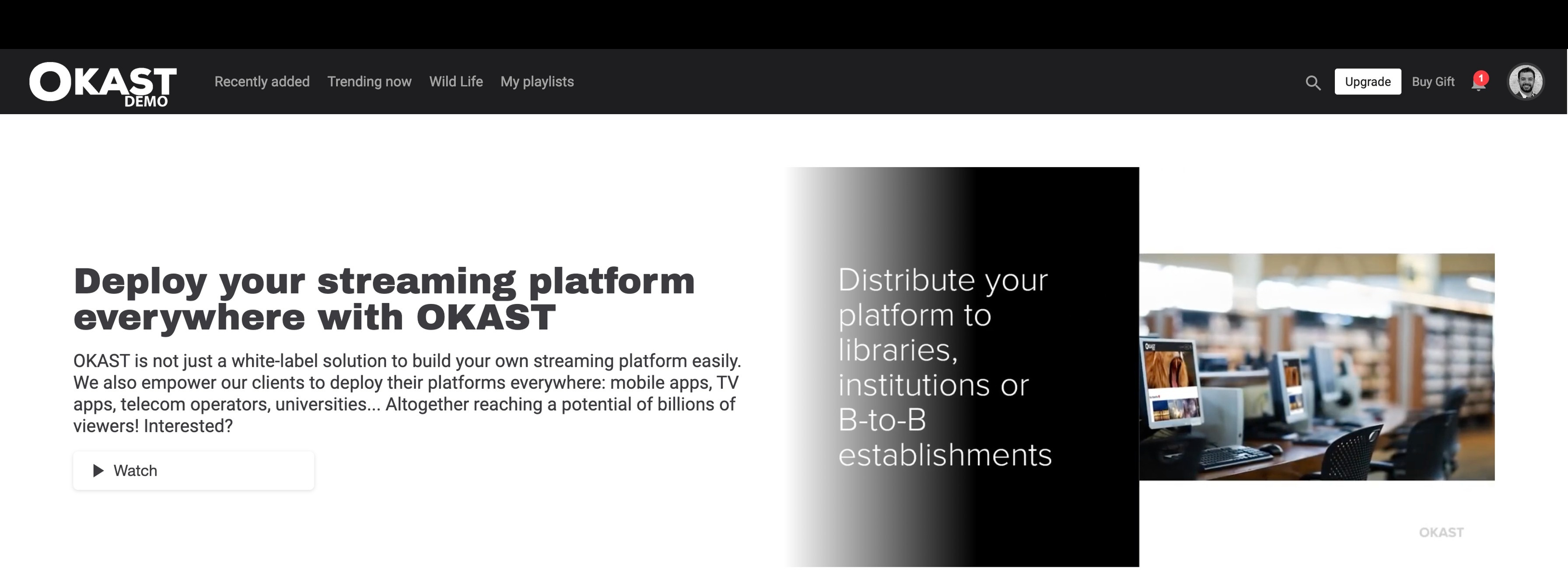
OKAST offers a module for organising and customising the home page of your platform: the Component Editor. Accessible via the menu > PLATFORM > Layout > Home page.
TABLE OF CONTENTS
Organizing the homepage by device
You can organize this homepage according to the devices on which your platform has been deployed: Web, Android Application, iOs Application.

If you want to manage the layout for different devices in the same way, leave only the web tab.
If you now want to manage the layout across devices independently, you can choose to duplicate the layout of the homepage of another device:

If you want to manage the layout by device independently, you can add a device and not check the box “Duplicate an existing page?”
From now on, with this organization by device, when you create a smart component in a device, it will be done independently from the others. You can therefore have a content strategy that is specific to each device on which your platform has been deployed.
Managing the homepage
Once your different devices are set up, you can manage from here the organization of the homepage of your platform.
You have the list of the smart components of your homepage with different useful information.

- The name of the smart component, which will only be visible on the back office side.
- The smartlist to which the smart component is attached.
If no smartlist is indicated, it means that the component is attached to a dynamic list. - The status of the smart component and/or the smartlist:
- Green icon means that the smart component and/or the smartlist is active on the homepage.
Red icon means that the component and/or the smartlist is inactive, therefore not visible on the platform. - The image format that the smart component displays (ex: 16:6, 3:4, etc.)
- The type of display of the smart component: mosaic
 , carousel
 , widget
 , highlight
 and FAQ
- A icon indicating that the smart component is attached to a dynamic list: My list
 , Resume Watching
 , Content recommendation
  , Purchase
  end Now
 .
.
The order in which the smart components are displayed determines the order in which they are displayed on your homepage. If you want to change the display of a particular smart component, you can simply drag and drop it to reorganize your homepage. 

The creation of smart components
There are 5 types of smart components: Mosaic, Carousel, Widget and Highlight.
- Mosaic display the contents one after the other and on as many lines as necessary.
- Carousel are displayed on a single line and scroll horizontally.
Mosaics (1) and Carousels (2) can be based on 'Standard Smartlist' like 'Smartlist' or 'Dynamic Smartlist' to choose :
- My list. See our dedicated article.
- Resume watching. See our dedicated article.
- Recommended. See our dedicated article.
- Purchase for your users.
- Now. See our dedicated article.
- Most viewed. See our dedicated Article. See our dedicated article.
- Widgets are interactive tools for displaying information, entertainment, articles, links, advertising, games, etc. Dedicated article on setting up widgets.
- Mise en avant launches a video automatically when the home page is opened. Dedicated article on highlighting.
- The FAQ displays a block of text and a button. 
1. Mosaic type component
 The mosaic component is the simplest to set up.
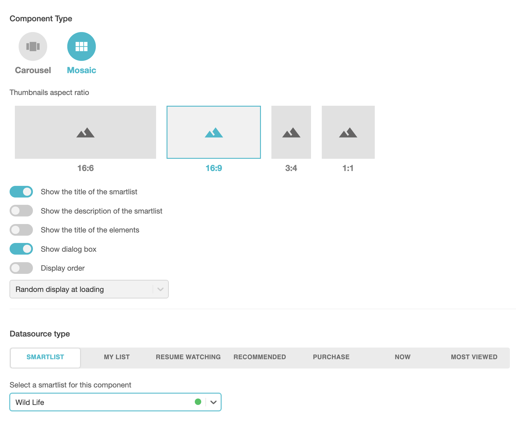

a. Type of Component
- Choose a name for your smart component that will be visible only from the back office.
- Activate or deactivate the smart component on the storefront.
- Choose the image format you want for your smart component. You have 4 different ratio:
- 16:6 “banner”
- 16:9 “thumbnail”
- 3:4 “poster”
- 1:1 “square” (in the mobile version, the number of visible elements must be 1 or 4 and more for reasons of phone screen ratio)
For a reminder of the exact dimensions, see our dedicated article. - Display parameters :
- Display the Smartlist title above the component.
- Display item titles below each item.
- Display the dialogue (for more information, see our article on the dialogue option)
- Choose the order in which the items in your Smartlist are displayed
- Random on first load
- Random on each refresh
- Alphabetical
- Newest to oldest
- Oldest to newest
b. Datasource type

- My list. See our dedicated article.
- Resume watching. See our dedicated article.
- Recommended. See our dedicated article.
- Purchase for your users.
- Now. See our dedicated article.
- Most viewed. See our dedicated article.
c. Conditional render
You can enable or disable the display conditions of each smart component you set up.
These display conditions are linked to the connection to the platform and to the subscription to the platform:
- The user is/is not logged in
- The user has/has not an active subscription
It is possible, within the limits of the possible, to link two conditions, as for example: The user is connected AND The user has not have an active subscription.
2. Carousel component
 The Carousel-type component is the most widely used in home shopping platforms.

Each carousel component can be customized according to various parameters. Select the image format and component format, on one or two lines. You can also hide these images from the PLATFORM / Layout / Smartlist Page menu.
a. Type of smart component
- Choose a name for your smart component that will be visible only from the back office.
- Activate or deactivate the smart component on the storefront.
- Choose the image format you want for your smart component. You have 6 different ratio:
- 16:6 “banner”
- 16:9 “thumbnail”
- 3:4 “poster”
- 1:1 “square” (in the mobile version, the number of visible elements must be 1 or 4 and more for reasons of phone screen ratio)
- 2:3 "landscape"
- 16:3 “banner”
For a reminder of the exact dimensions, see our dedicated article. - Display settings :
- Enable customization (Background color and/or Items border color)
- Display the smartlist title above the smart component.
- Display the titles of the elements below each of these elements.
- Display the dialog (for more information,see our article on the dialog option).
- Enable the circular carousel where the smart component and its elements scroll indefinitely.
- Enable the automatic scrolling where the elements of the smart component scroll automatically when you browse the homepage.
- Display the navigation arrows (inside or outside the image) and choose to display the arrows only when hovering over them.
- Choose the number of items visible and displayed on the home page (between 1 and 10).
- Choose the order in which the items in your Smartlist are displayed.

b. Datasource type

- My list. See our dedicated article.
- Resume watching. See our dedicated article.
- Recommended. See our dedicated article.
- Purchase for your users.
- Now. See our dedicated article.
- Most viewed. See our dedicated article.
c. Conditional render
You can enable or disable the display conditions of each smart component you set up.
These display conditions are linked to the connection to the platform and to the subscription to the platform:
- The user is/is not logged in
- The user has/has not an active subscription
It is possible, within the limits of the possible, to link two conditions, as for example: The user is connected AND The user has not have an active subscription.
3. Widget type component
To set up a widget-type component , see our article on setting up widgets. These are interactive tools that display information, entertainment, articles, links, advertising, games, etc.
4. Highlight component
To set up a Highlight component , see our dedicated article on Highlighting. This enables a video to be highlighted automatically when the home page is opened.
5. FAQ component
This component allows you to display text (questions/answers) on your home page. This block takes the form of a title followed by one or more scrolling text blocks. You can also add a Call To Action button.

Adding languages with the pictogram is displayed by choosing the site language in the footer.

You can add questions using the button and edit an answer using text, url or image styles.

6. Shortcut component
The Shortcut component displays , themed menus on your home page for direct access to content with metadata.
You can place this component multiple times on the home page. Its design (colors and font) can be modified using the graphic customization option.
You can use this component to display the following metadata sources:
- Target audience
- Type
- Theme
- Format

As a reminder, the metadata sources for content are available directly in the media in question, from the menu Description.